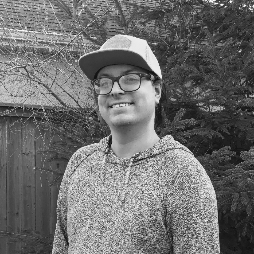
Photo of Aidan Wilson
Aidan

Hello, I’m Aidan.

Over the course of my journey through the Communications Design program, I have discovered a passion within myself for Motion Design. It combines my love of filmmaking, illustration and storytelling into one groovy package. Theres a special feeling of joy you get from seeing your animations start to move around and exceed the confines of a screen. My experiences in this course has reaffirmed a belief that design is best used to elevate stories and voices that need to be heard. Inspiration comes to me in many forms, from the worlds of movies, to movement of comics and vibes of funky design are what I’m particularly drawn to. Outside of all my creative design endeavours, I adore playing and watching basketball, and most other sports including a recent interest in F1 that I picked up over quarantine.
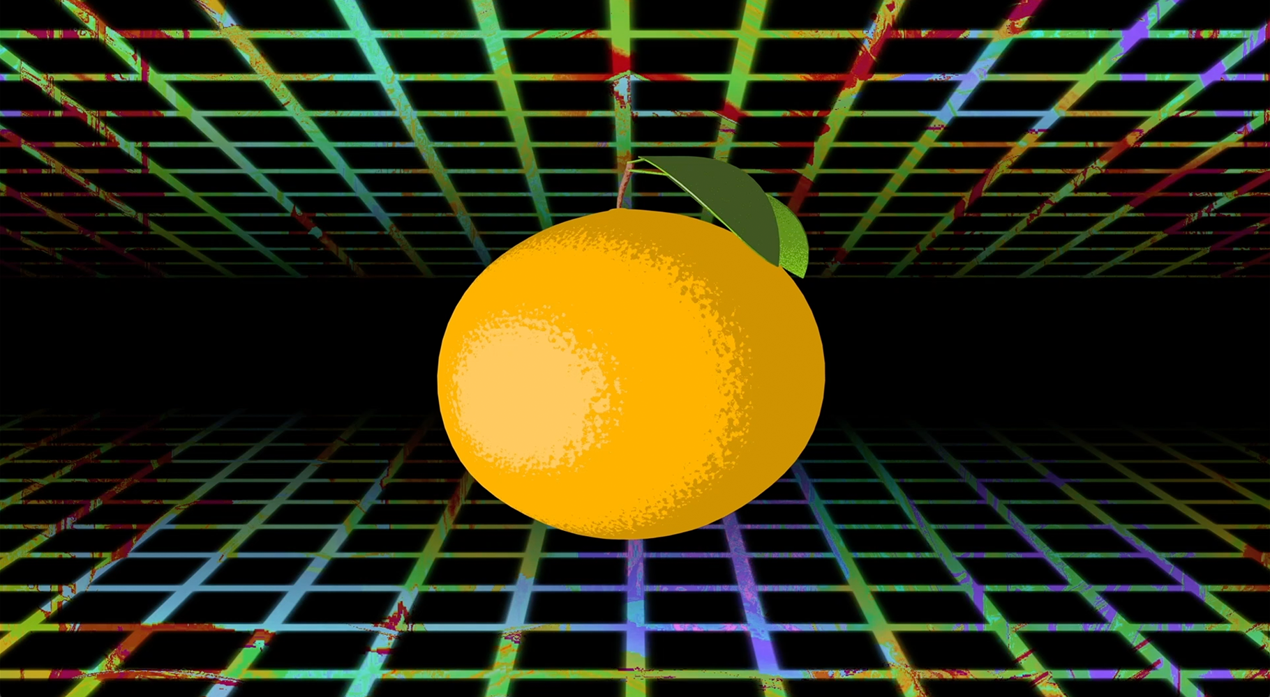
Still from Aidan's demo reel

Demo Reel

Over the course of this year I discovered that my passion for Motion Design was very real. I would sink all the free time I had into learning and discovering new techniques that I could implement into my work. This resulted in me implementing motion into where ever I could, I've taken the best parts of all those projects and edited them into a demo reel whose link can be found down below. The image I've chosen for this post was taken from the promo video I created for my Pulp brand, as it showcases the work I'm most proud of. It features a cinema 4d model that I created myself, and special little tricks used in the creation of the grid effect. You can find my demo reel here.
  • Branding
  • Illustration
  • Typography
  • Uncategorized
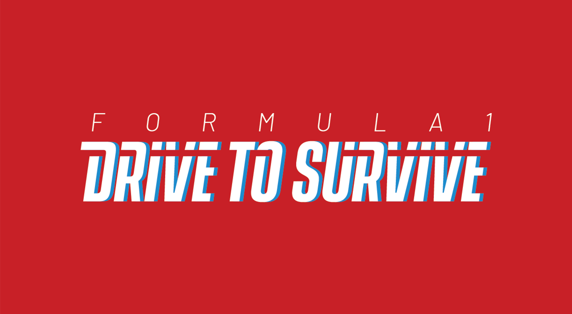
Drive to Survive Logotype

F1: Drive to Survive

This logotype was created as the centre piece of an animated title sequence for tv show, that was designed around being typography heavy. In creating this I was faced with creating a piece paid homage to the history of Formula 1 while keeping the style modern and inventive. The knock out line running through most of the letters represents the motion of the cars and can be seen in full effect in the title sequence, a link to which can be located below. You can find the title sequence here.
  • Branding
  • Typography
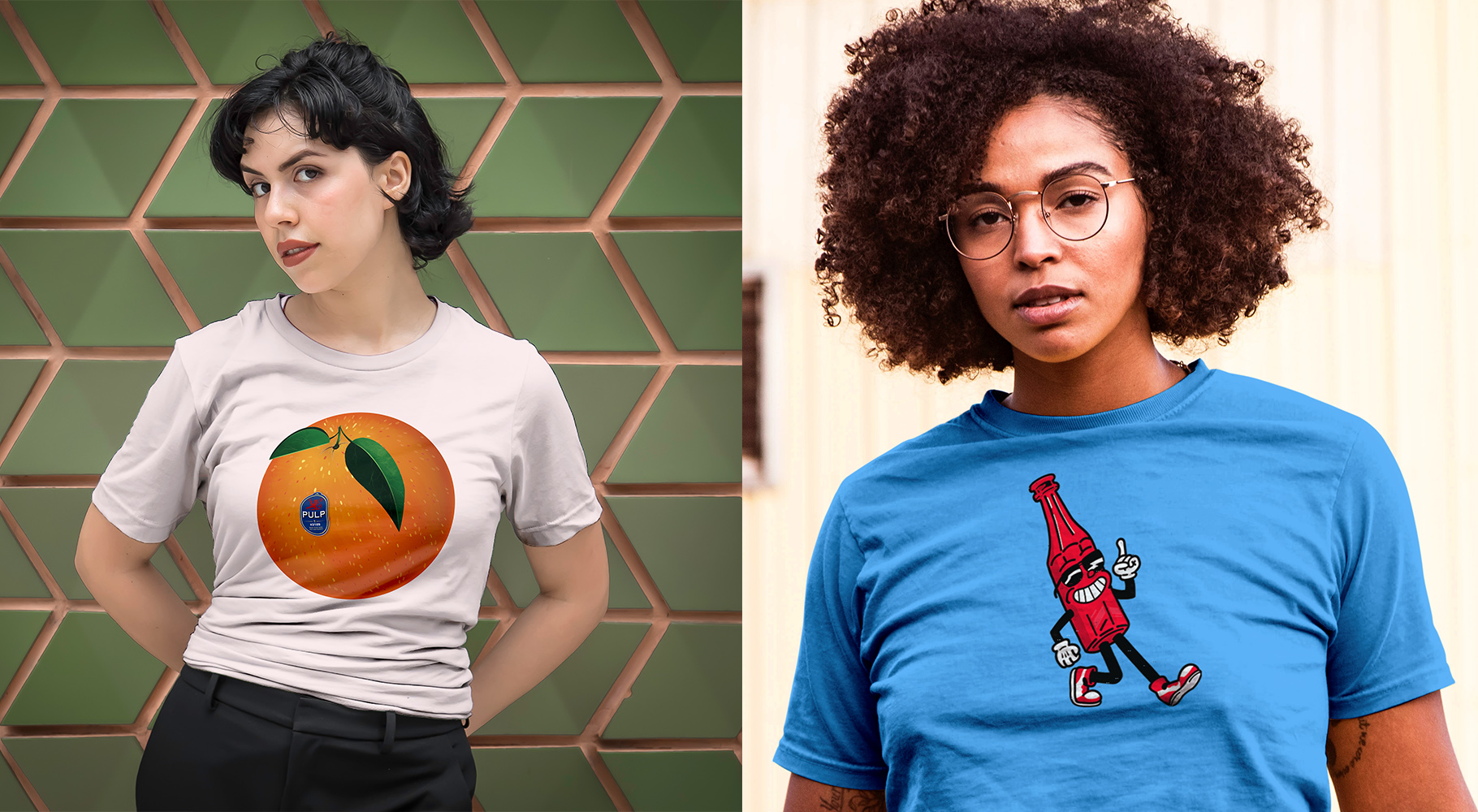
Mockups of Pulp Apparel

Pulp Apparel

Pulp Apparel is the largest project I took on this year and easily the most rewarding. It started out as a project in my mentorship course where I would create a promo video for an initially fictional apparel line that was centred around an alias that I had used since high school. I used this project as a place to play around and explore motion graphics as well as illustration styles. When I picked up this project again in second semester, I decided to make this apparel line a reality and worked on creating another promo video and selecting shirts that I felt represented my personality. The images featured here are mockups of my two favourite designs.   You can check out my shop here, and the promo video here.
  • Branding
  • Illustration